Elements
Basic Elements like Buttons, Images, DatePickers etc.
Button

A simple Button with Text and/or Icon
ButtonSegmented

Button with several actions/button combined into one, act more like a switch
Carousel

A element for presentation of images and other content like a slideshow

ChartBar

Bar Chart for visualizing data
ChartLine

Line Chart for visualizing data
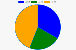
ChartPie

Pie Chart for visualizing data
CheckBox

Simple Checkbox with a Label
DatePicker

DatePicker with a Popup Calendar
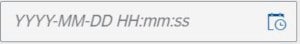
DateTimePicker

Date and Time Picker with a Popup Calendar
Dialog

Popup Dialog for Displaying Messages or other content like forms
Dropdown

A dropdown field that allows selection of values
Icon

Display an Icon from the Icon Explorer
Image

Display an Image from the Image Explorer / Assets or external Source
ImageLightBox

Display a larger Image in a separate dialog
Input

Input Field for gathering data from user
List

Simple List for display multiple data records
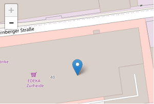
Map

A mobile-friendly and interactive map based on Leaflet
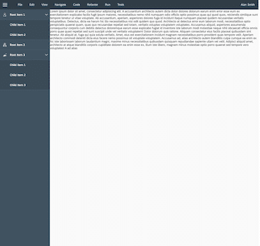
Panel

Represents a container with scroll functionality, that can be used for text and controls. The Panel does not layout the embedded controls.
PopupMessage

Basic Dialog with a single Message and OK Button
PopupToast

A small, non-disruptive popup for messages that disappears automatically after a few seconds
RadioButton

RadioButton is a control similar to a checkbox, but it allows you to choose only one of the predefined set of options
ScanAndSearchBar

A Element for Searching Values with additional Barcode Scan Button
SearchField

An input field to search for a specific item
Slider

Slider to adjust a Value in a Number Range
Switch

A switch is an control that is used for change between binary state like on/off, true/false
Table

Table for displaying multiple records, with filter and sorting functions – optimized for desktop scenarios
TableMobile
Table for displaying multiple records, with filter and sorting functions – optimized for responsive designs on mobile devices
Tabs

Tabs represents a collection of tabs with associated content for navigating and structure content without switching screens
Switch

The Text control can be used for embedding longer text paragraphs, that need text wrapping, into your app
TextArea

The text area is used to enter multiple lines of text. When empty, it can hold a placeholder similar to an input. You can define the height and width of the text area and also determine specific behavior when handling long texts.
Tile

Container Element that displays header, subheader, and a customizable main area in a tile format.
Title

A simple, large-sized text with explicit header / title semantics


Templates
Complete Screen Templates
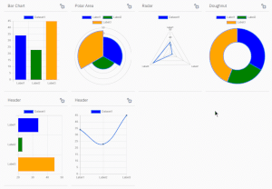
ChartDashboard

Dashboard Layout for Charts, highly Responsive
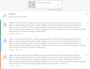
FeedbackCard

A control that represents a container with a predefined header and content. The card is a container for grouping and displaying information.
FormAddress

A simple Form for Address Display
FormContact

A simple contact form
LaunchPad

Block Element for arranging different elements in a block to visualize a main menu or launch pad
Login

Login Form for Username / Password Authentication

MasterDetail

List Element for displaying records combined with detail view for displaying details for each selected record
Navigation

Navigation Menu with Sandwich Button
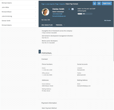
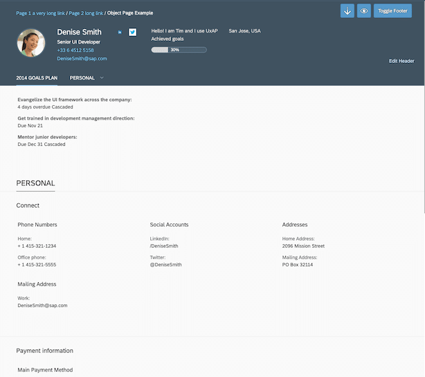
ObjectDetail

Detail Layout for Displaying Detail Information
QuickviewCard

A control that represents a container with a predefined header and content. The card is a container for grouping and displaying information.

SimpleForm

The SimpleForm provides an easy-to-use way to create simple forms. Inside a SimpleForm, a Form is created along with labels and inputs placed in a row